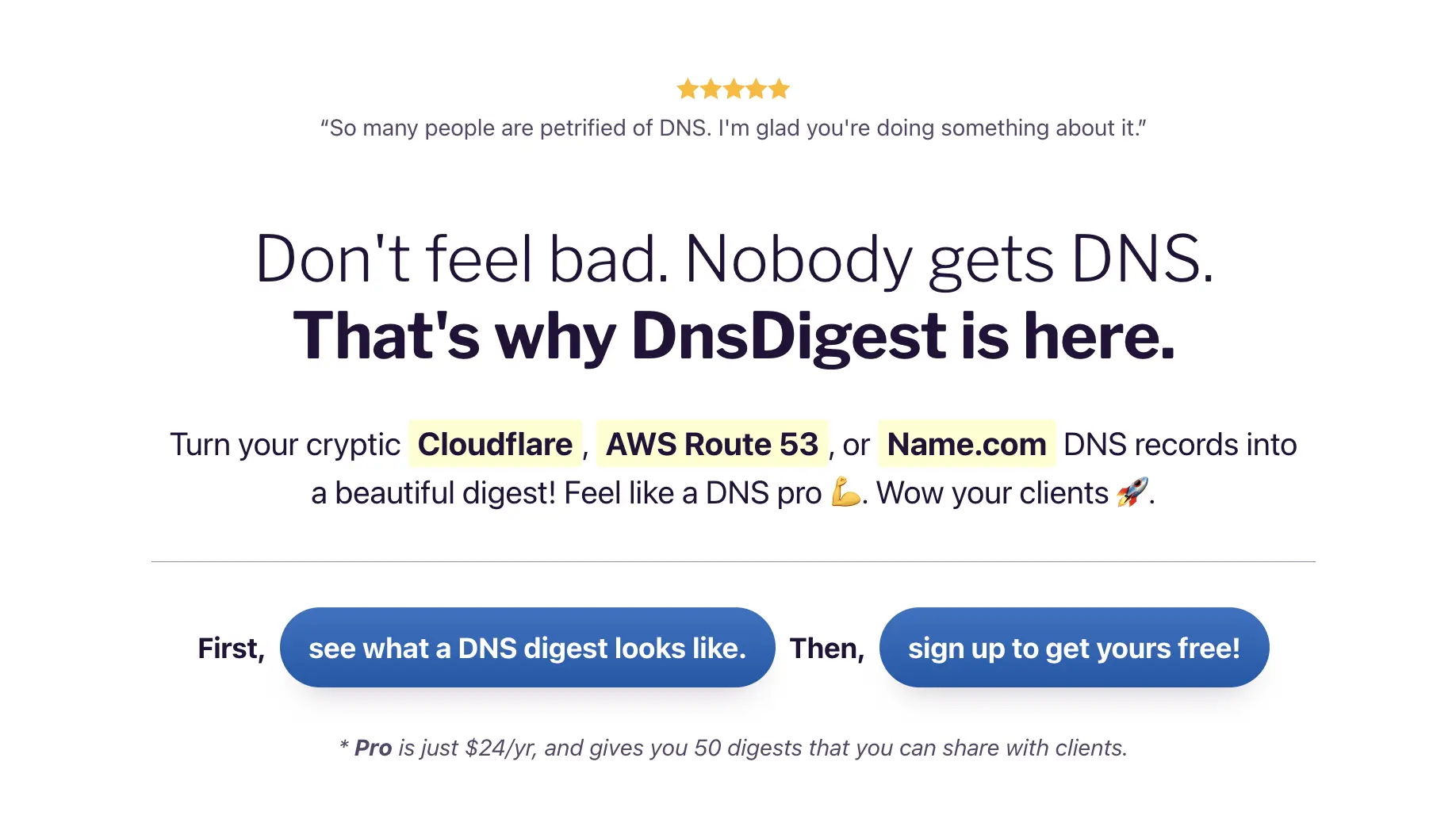
Giving hope to struggling DNS record managers.
I love when good design helps make confusing concepts more approachable. And what's more confusing than a laundry list of cryptic DNS records—the same ones that control everything about how your domain name works?
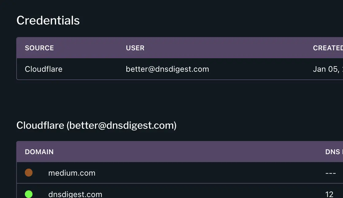
The answer to that question became the inspiration behind DnsDigest, a Rails app I created and released this past January. It converts your DNS records to an organized report and detects any potential issues with them.
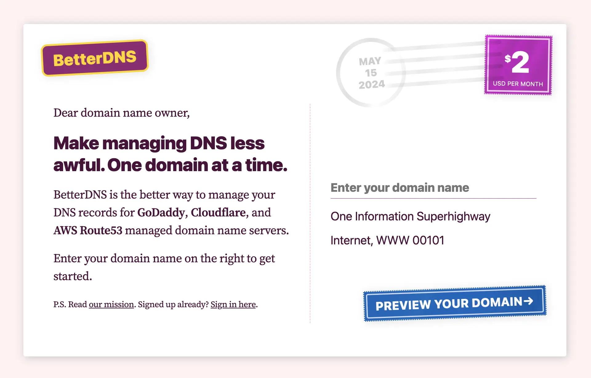
An early homepage alternative
My original idea for DnsDigest was to have it scan DNS records for any domain you enter. I built this HTML/CSS only homepage as a postcard, where you could type in your domain name and go. I scratched this approach due to some technical limitations but wanted to share the design.
The Dashboard
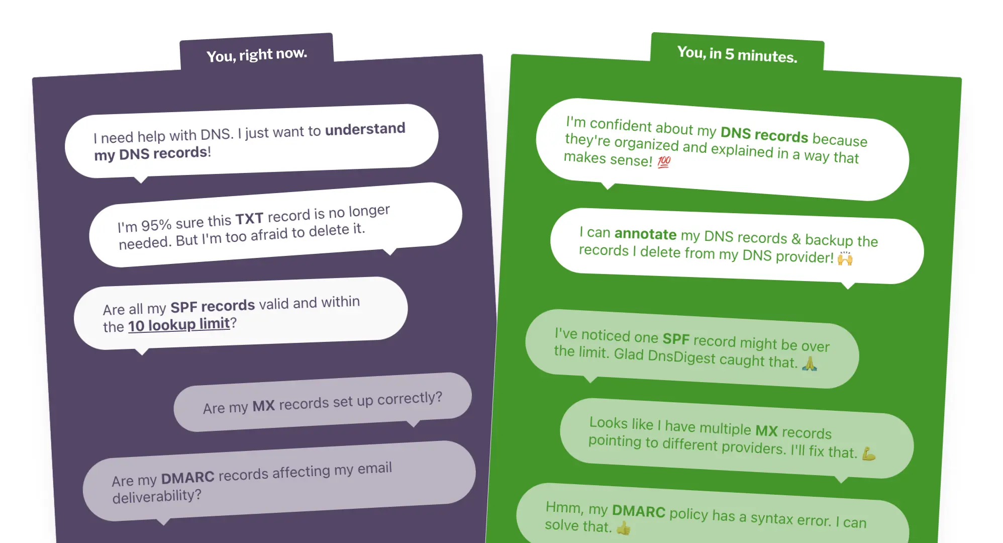
Inside the app, I wanted the first look of your DNS zone file to feel entirely different from the laundry list you'd expect. Instead, I consolidated records together into more meaningful groupings, which became the front doors to each of the more detailed sub-sections.
Playing with metaphors
So much of DNS is about routing and destinations. This project seemed like a great place to play with metaphors so DNS newbies could grasp concepts more quickly.
Explaining email deliverability
For SPF and DMARC records, I show how to interpret their TXT values. I also built an SPF lookup crawler that counts unique lookups to determine if they are over the recommended 10 maximum lookup limit.
Diagnostics view
I created a Diagnostics view that evaluates your records based on a series of checks. Using Stimulus, clicking a row triggers a modal via a Turbo frame replacement to show more details about the diagnostic check.
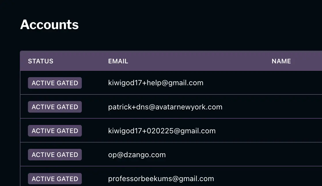
Back-office love
I always die a little inside when I see a beautiful app that has a clunky, ugly admin interface. I enjoy attending to the back-office just as much as the customer-facing side.
By the way, everything I've showed above (besides the admin) can be viewed in a sample DNS digest that's linked below. I hope you'll take a look.
Play with a sample DNS digest